Describing Graphs and Charts for SSC/HSC English 1st Paper
In new syllabus for SSC and HSC, students have a question in number 10 in English 1st paper where they have to describe a graph or chart. Here, I have shown 3 important Graphs and…
In new syllabus for SSC and HSC, students have a question in number 10 in English 1st paper where they have to describe a graph or chart. Here, I have shown 3 important Graphs and Charts for class ten and hsc with answers. Hope, you can understand how to describe graphs.
The chart shows some information, you have to describe the information and summarize in brief.
Easy Rules for Describing Graphs and Charts (Graph লেখার সহজ নিয়ম)
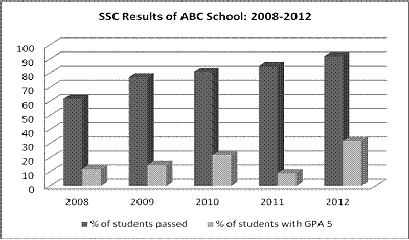
1. The graph below shows the results of SSC exam of ABC Secondary School from 2008 to 2012. Describe the chart in 150 words. You should highlight and summaries the information given in the chart.
Ans: The graph shows the results of SSC examinations of ABC Secondary School from 2008 to 2012. In general, the graph shows a gradual improvement of the SSC candidate’s performance within this time. It is seen from the graph that the pass rate increased from 60% in 2008 to 92 % in 2012.
The graph also shows an increase of candidates who passed with a GPA 5 except in 2011. In fact, the school had the lowest rate of GPA 5 holders in 2011, which was only 9%. The performances of the SSC candidates were almost similar in 2009 and 2010, with slightly better results in 2010. The school recorded the best results in 2012 when the pass rate went beyond the 90% mark. Moreover, a record of 32% of candidates passed with a GPA 5 this year.
Overall, the graph illustrates that the SSC results of ABC Secondary School are improving steadily.
Let’s See How to Describe a Graph
কিভাবে Graph Chart লিখতে হয়
ধাপ-১: প্রথমে ২ টি বাক্যে আমরা গ্রাফ বা চার্ট এর বিষয়ে নিচের Structure এ সংক্ষেপে লিখবঃ
উপরের প্রশ্নে বলা হয়েছে, The graph below shows the results of SSC exam of ABC Secondary School from 2008 to 2012. এখানে লাল লেখাটি হচ্ছে গ্রাফ এর বিষয়বস্তু এবং আমরা গ্রাফে দেখি যে ক্রমাগত এসএসসি পরীক্ষার্থীদের পাশের হার বৃদ্ধি পাচ্ছে। এটিকে আমরা ক্রমাগত উন্নতি বা (gradual improvement) বলতে পারি।
ধাপ-২: এর পর আমরা গ্রাফের তথ্যগুলো নিচের ধারাবাহিক বর্ণনা করবঃ
2008 সালের কলামে আমরা দেখি পাশের হার 60% ছিল এবং 2012 সালে বৃদ্ধি পেয়ে তা 92% হল। তাই এভাবে লিখতে পারিঃ
It is seen from the graph that the pass rate increased from 60% in 2008 to 92 % in 2012 (in 4 years)
একইভাবে GPA 5 এর সংখ্যাও বৃদ্ধি পেয়েছে, শুধুমাত্র 2011 ছাড়া। তাই এভাবে বর্ণনা করতে পারিঃ
The graph also shows an increase of candidates who passed with a GPA 5 except in 2011
এরপর অন্যান্য বছরের পাশের হার ও GPA 5 এর হার তুলনামূলক ভাবে বর্ণনা করবে। এজন্য বিভিন্ন স্টাইল বা প্যাটার্ণ ব্যবহার করা যেতে পারে।
ধাপ-২: সবশেষে গ্রাফের তথ্যাবলি নিয়ে একবাক্যে একটি মন্তব্য লিখতে হবে, যেমনঃOverall, the graph illustrates that the SSC results of ABC Secondary School are improving steadily.
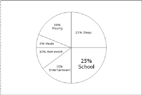
2. The graph shows Rubi’s time spending on different activities. Write a paragraph describing the information of the following graph.

Ans: The graph shows Rubi’s time spending on different activities. In general, she spends most of her time in school and sleeping. She spends 25% of total time in sleeping and the same in school. She gives the least time in meals, which is only 6% of her time.
Besides, it is seen from the graph that she spends 15% time in entertainment, 10% in homework and 19% in playing. So it can be said that she also spends much of her time in entertainment and playing but less in homework.
Write a paragraph describing the information of the following graph.
Ans: The graph shows the month-wise attendance of Asif from January to August. It is seen in the graph that his attendance is was highest in the month of April which was 26 days and lowest in August which was 11 days. He was present 25 days in January. His attendance was similar in February and March which was 24 days. He was present 17 days in May, 15 days in June, 22 days in July.
So, it can be said that he was very regular in the first four months from January to April and quite irregular in last four months.
