Pie Chart | Changes in Annual Spending by a Particular UK School
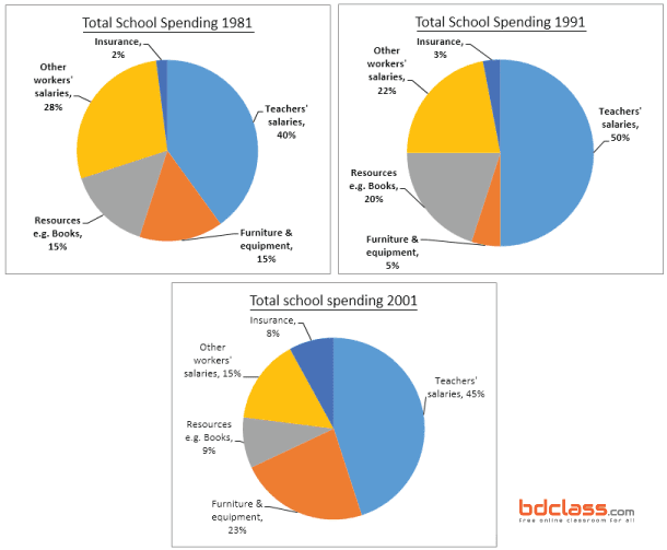
The following pie charts below show the changes in annual spending by a particular UK school in 1981, 1991 & 2001. Summaries the information by selecting and reporting the main features, and make comparisons where…
The following pie charts below show the changes in annual spending by a particular UK school in 1981, 1991 & 2001.

Summaries the information by selecting and reporting the main features, and make comparisons where relevant.
Answer: The given 3 Pie Charts display the yearly consumption of a UK school take turn in three separate years (in 1981, 1991 and 2001).
Overall, it can be seen from the charts, the school spent a large amount on the teacher’s salaries, and it spent a small part on the insurance. It also spent on worker salaries, books and equipment. Though all of these went through changes.
Firstly, in 1981, teacher’s payments cover a large area of school expenditure. It was 40%, but after 10 years(in 1991) it shows an improvement of 50%. In 2001, it was slowly declining to 45%. On the other hand, other worker’s wages was 28% in 1981, which was gradually going down to 22% and 15% in this period.
Secondly, school resources cost was 15% in 1981. Then it presents slightly up and down, like 20% and 9% in 1991 and 2001. moreover, furniture and equipment spent were 15% in 1981. It shows the moderate fluctuation in the next mentioned two years, at 5% and 23%. Apart from this, the school also has insurance cost and it is 2% in 1981 as well as it presents an upward trend in the rest of the period, like 3% and 8%.
