20 Most Popular and Best Fonts for CV Writing
When it comes to writing your CV, you may take minutes to choose the best font. You shouldn’t randomly select a font from the font list of Microsoft word program. A good and correct font…

When it comes to writing your CV, you may take minutes to choose the best font. You shouldn’t randomly select a font from the font list of Microsoft word program.
A good and correct font that is scannable and easier to read grabs the recruiter’s attention. It also tells about your personality and professionalism, which can help a recruiter know about you before he meets you.
On the other hand, a crappy font may be the only reason you are not getting the job.
So, never give them a reason to throw your CV into the dustbin using a font like Comic Sans.
Here are the most popular and best 20 fonts for your CV which can boost your chances of being called for an interview.
You may also read: Common Mistakes You Must Avoid in CV Writing
There are mainly four types of fonts:
Serif – fonts that have serifs aka small lines at the ends of characters (examples: Times New Roman and Baskerville)
Sans-serif – sans is French for ‘without’, meaning they don’t have serifs (examples: include Helvetica and Verdana)
Script – fonts that have modern or historical handwriting styles (examples: include Brush Script and Vivaldi)
Decorative – these fonts are characterized by unusual features like splash and pizzazz to a design. These types of fonts are used for design purposes. (examples: include ITC Matisse and Outlaw)
Let me say about the Script and Decorative Fonts. It doesn’t matter how cute or elegant the fonts look, they’re simply distracting and unreadable sometimes.
Now you are left with Serif and Sans-Serif fonts. Both of the fonts are easier to read and most commonly used in CV.
Let’s see the fonts and know more about them.
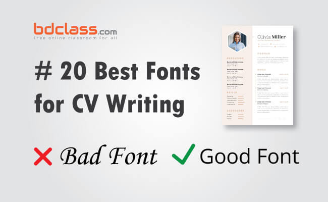
20 Best and Most Used Fonts for CV
These fonts are listed without any particular order. You can choose any of them according to your choice.
1. Calibri
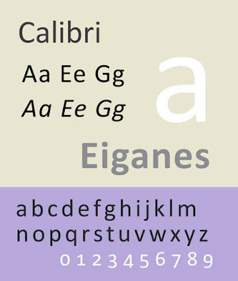
(Font type: Sans-Serif) Calibri has been added in Microsoft Word as the default font in 2007.
2. Helvetica
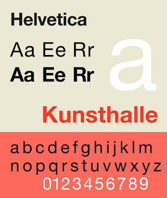
(Font type: Sans-serif) Helvetica remains a popular choice for many commercial wordmarks like Behance, Lufthansa and Skype. The font is widely used by the US and Canadian governments for its clean and professional appearance.
3. Gill Sans
(Font type: Sans-serif) Gill Sans is also a clear and professional-looking font. You can use this font for a CV without any thought.
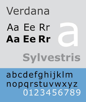
4. Verdana
(Font type: Sans-serif) Verdana was released in 1996. Its name is a portmanteau of the word ‘verdant’ which means something green and Ana which is the name of the designer and painter Virginia Howlett’s daughter).
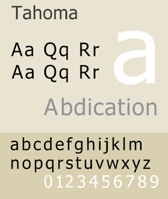
5. Tahoma
(Font type: Sans-serif) Tahoma was designed by Matthew in 1994. He was also the designer of Verdana. It is similar to Verdana in appearance but has a narrower body and tighter letter spacing than Verdana.
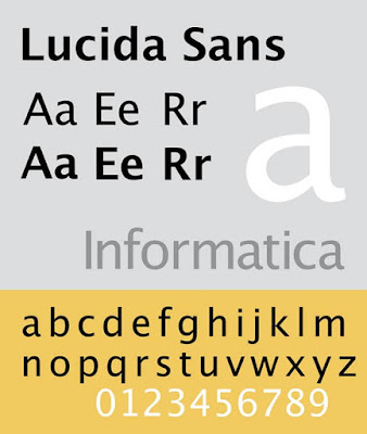
6. Lucida Sans
(Font type: Sans-serif) Lucida Sans was designed in 1985 as sister font type Lucida Serif. The font is best suitable for low-resolution displays due to its small size.
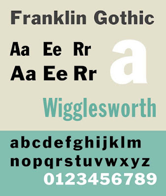
7. Franklin Gothic
(Font type: Sans-serif) Franklin Gothic is suitable for headlines rather than extended text. Nowadays, it maintains a high profile. Now it’s being used in a number of advertisements, newspaper headlines, books and billboards.
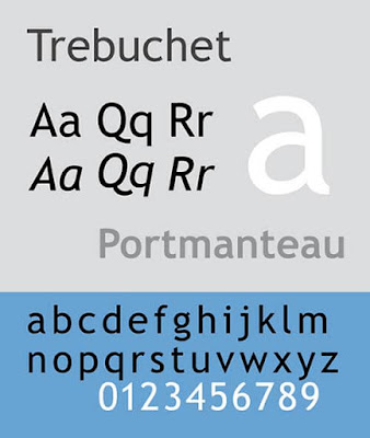
8. Trebuchet
(Font type: Sans-serif) Trebuchet was released in 1996 and named after the trebuchet which is a medieval siege engine. It was used as the default font for window titles in Windows XP.
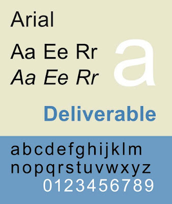
9. Arial
(Font type: Sans-serif) Arial was designed in 1982 to be metrically identical to Helvetica so that a document written in Helvetica could be correctly displayed and printed without paying for a license.
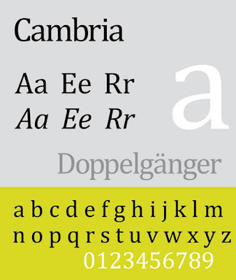
10. Cambria
(Font type: Serif) Cambria is popular for its readability whether printed in small size, displayed on a low-resolution screen or even spacing and proportions.
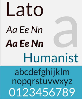
11. Lato
(Font type: Sans-serif) The was designed by Polish designer Łukasz Dziedzic in the summer of 2010. The word ‘Lato’ means summer in Polish.
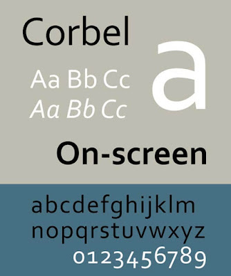
12. Corbel
(Font type: Sans-serif) Corbel has been described as a humanist sans-serif typeface. It was designed by Jeremy Tankard in 2005. The font is part of Microsoft’s ClearType Font Collection.
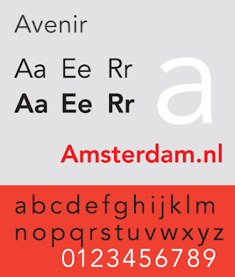
13. Avenir
(Font type: Sans-serif) Avenir is a premium font that was designed by Adrian Frutiger in 1988, who has described Avenir as his ‘finest work’. Avenir has been used by the city of Amsterdam as the primary font for its identity as well as by the Eurovision Song Contest.
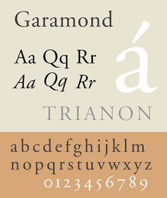
14. Garamond
(Font type: Serif) Garamond is a timeless typeface and is named after Claude Garamond, a French type designer, His designs influenced many modern Garamond revisions.
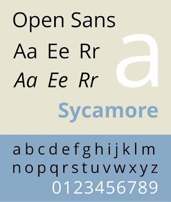
15. Open Sans
(Type: Sans-serif) Perhaps, Open Sans is the most popular font type. It is used by many organizations and websites as their official font.
16. Goudy Old Style
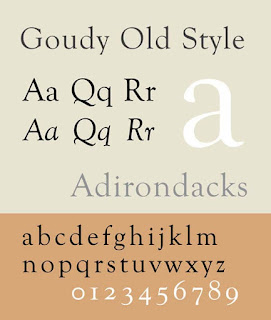
(Font-Type: Serif) This is a classic old-style font. It is described as a graceful typeface with a few balanced eccentricities. This font is particularly suitable for headings and titles.
17. Baskerville
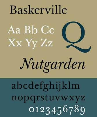
(Font type: Serif) Baskerville was designed in the1970s by John Baskerville, Baskerville is categorized as a transitional typeface. The font is included in some of Microsoft’s software.
18. Georgia
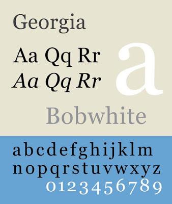
(Font type: Serif) The font was designed in 1993 for Microsoft.
19. Constantia
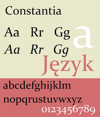
(Font type: Serif) This font was designed in 2003 for either print or on-screen uses, Constantia is part of the ClearType Font Collection including three other fonts of this list: Calibri, Cambria and Corbel.
20. Didot
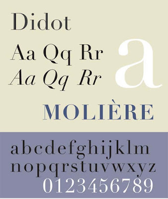
(Font type: Serif) Didot was first graced printed page back in 1784. You may use this for printed CV.
Hope you’ll find the post helpful. All the 20 fonts are most used by the professionals officially. You may use any of them without any thought.
Be safe and sound and remain with bdclass.com


